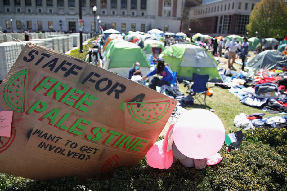
What Professors Owe Our Students Right Now
6 MIN READ
'If we are to reclaim our university, faculty and students must do it together,' writes professor Nara Milanich
'If we are to reclaim our university, faculty and students must do it together,' writes professor Nara Milanich


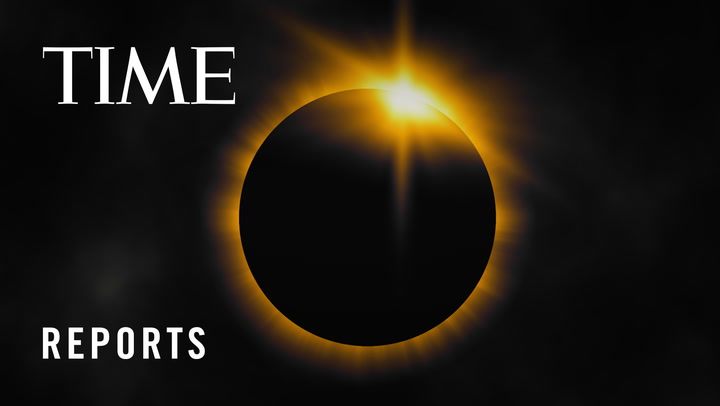
A rare total solar eclipse will occur across Mexico, the U.S., and Canada on April 8, 2024, when the moon will pass between the Earth and the Sun, blocking the sun’s rays during the day time, causing a temporary period of darkness. TIME Editor-at-Large Jeffrey Kluger explains the best way to experience it.


Subscribe now to get unlimited access to TIME.com and more!


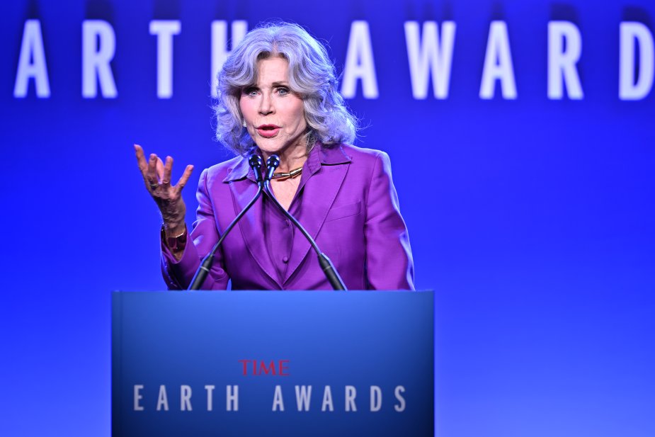
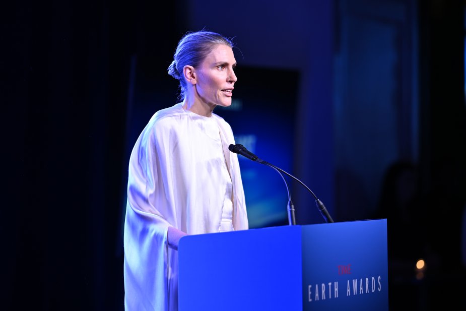
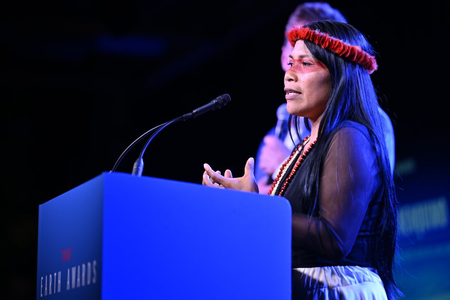
Actress and TIME Earth Award honoree Jane Fonda urged Americans to leverage their voting power to make politicians care about the climate crisis.

The judge overseeing the former president's criminal trial is familiar with his history, in and out of court.


On Thursday, the song, which was originally released on April 19, was scrubbed from Drake’s Instagram page and from his X account.


New research about incentives, collaboration, and connection.